-
 Our very own international style: Beans from Guatemala, Peru, and Brazil join a sans serif typeface from Switzerland in a coffee so smooth and balanced that it’s just as delicious from a French press as it is in an Italian ristretto. (Or a good old-fashioned American drip.) Wondering what to put this delicious brew in? Wonder no more.
 -
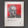 Inspired by a design from SFCC student Corri Woods, this 8.5” x 11” likeness of Haas Type Foundry project manager Eduard Hoffman is proof that even a 9-to-5 middle management position can eventually lead to typography immortality.
 -
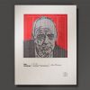 Inspired by a design from SFCC student Corri Woods, this 8.5” x 11” likeness of Helvetica designer Max Miedinger is the perfect centerpiece for your home’s Swiss sans serif shrine. (You do have one of those, don’t you?)
 -
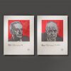 Helvetica’s two dads, immortalized in three colors. Buy the set and save around 4 CHF – enough for a medium pommes frites at the Münchenstein McDonald’s. (There’s a German joke about Swiss frugality that goes something like this: “Why did the Swiss executive fly third class? Because there was no fourth class!”)