We love the idea for Jim Krause’s “Visual Design: Ninety-five things you need to know. Told in Helvetica and dingbats.” Here’s Jim on why he used Helvetica:
“Helvetica was chosen as the font for this book’s text—and for nearly all of the words used within its images—simply because Helvetica is one of those very rare fonts that cannot only deliver a wide range of thematic conveyances (think, for instance of the elegant look of a headline set in the thinnest possible weight of Helvetica versus the commanding boldness of a block of text set in Helvetica Black), but it can also act as an almost invisible thematic component for a layout or illustration whose other visual elements are meant to set the piece’s mood. Know many other fonts that can claim this remarkable set of qualities in quite the same way? I don’t.”
And why Dingbats?
“Because dingbats—like Helvetica—tend to convey themselves without a great deal of self-aggrandizing fanfare,and therefore are capable of adapting to a wide range of styles and moods within the layouts and illustrations they inhabit.”
When you put it like that, who can argue?
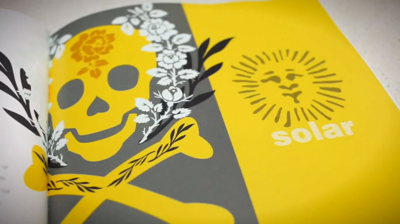
Here’s a preview of a few of Krause’s things you need to know.